I am currently in the third year of my PhD and it is time for me to synthesize all the work I have done by writing my thesis. One important step is the introduction which presents the general context and the contributions of my thesis in the research world. For my introduction, I decided to include the Google trend analysis of specific terms related to my PhD subject. For information, the aim of my PhD is to demonstrate the potential contributions of statistical learning methods in the study of coastal risks.
In this post, we are going to use the R package gtrendsR to analyze the trends of specific words related to statistical learning such as “machine learning” or “data science” and also related to coastal risks: “coastal flood”, “storm surge”.
Analysis of specific terms for the whole world
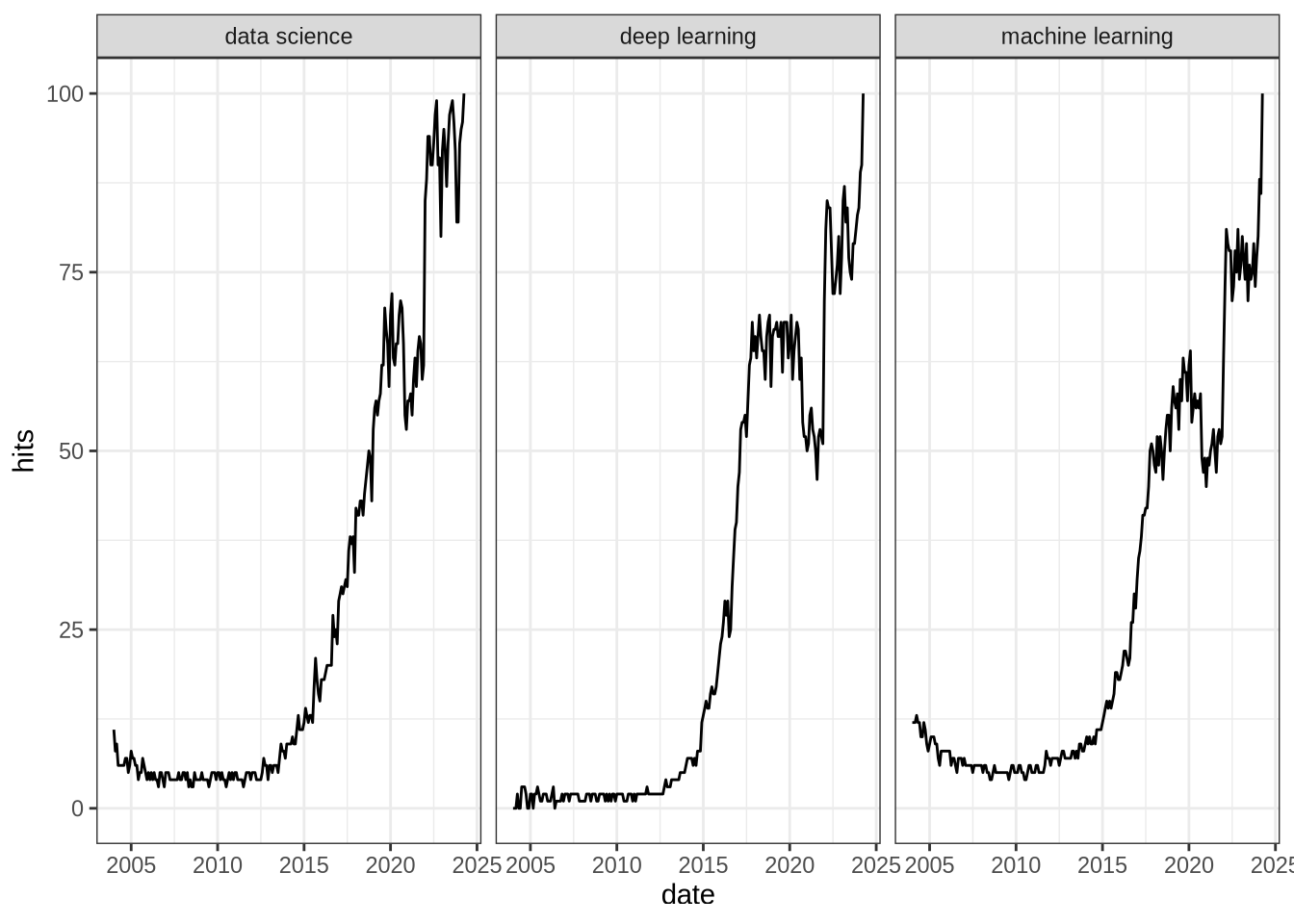
In this first section, we are going to analyze the interest over time for several terms in the whole world. The gtrends function extracts the “hits” variable for a given term. This variable is a normalized measure of the interest made by Google Trends. The number of search is normalized by geography and time range, then the resulting numbers are scaled on a range of 0 to 100 based on a topic’s proportion to all searches on all topics. All the details are given in the support of Google Trends (here).
We can look at the interest over time for “data science”, “deep learning” and “machine learning”:
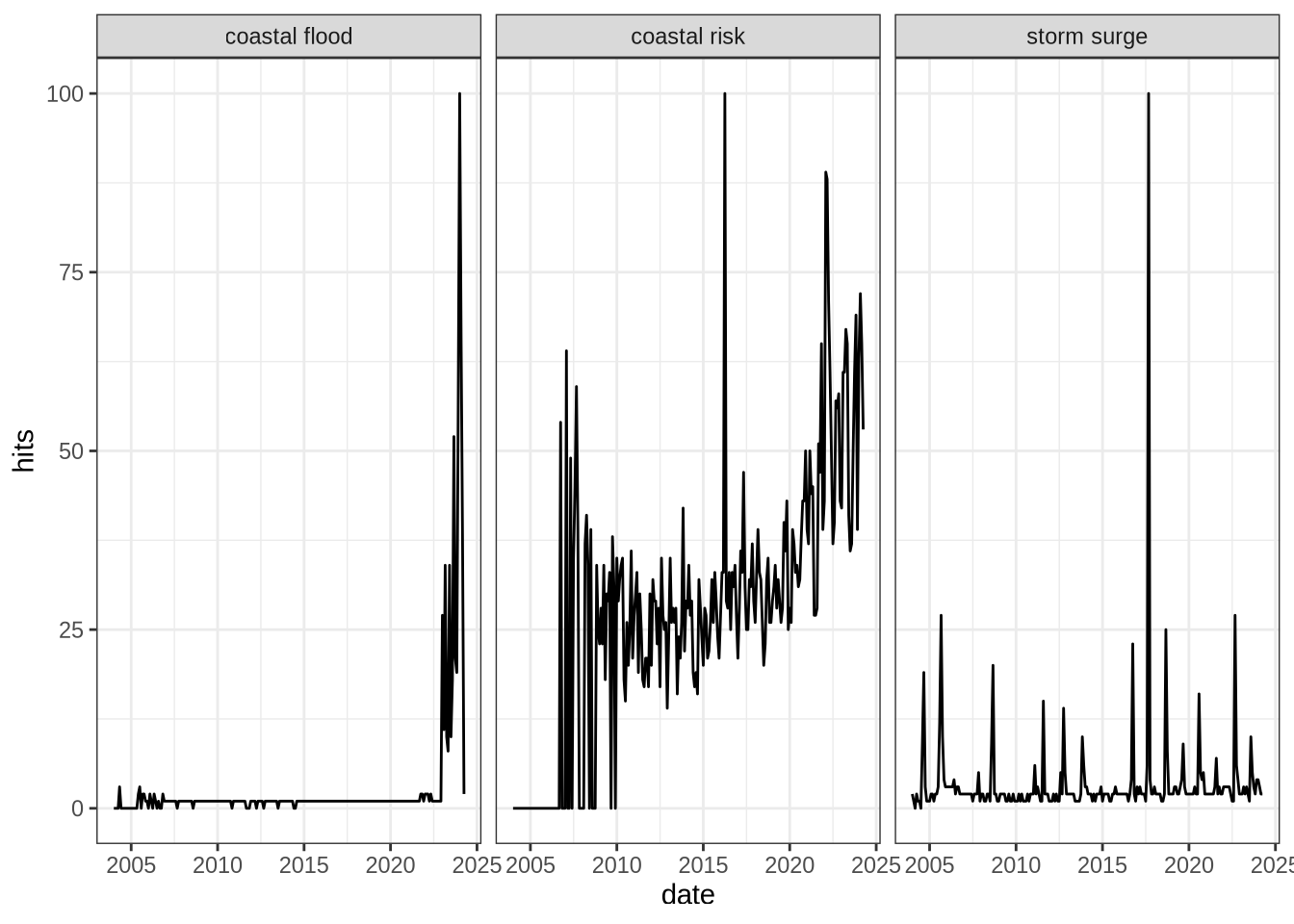
Contrary to the interest for the statistical terms, the interest in terms related to coastal risk is more punctual. One of my hypothesis is that the interest in these topic increases after a large storm event has occurred in the world. We will investigate on this hypothesis at the end of the post.
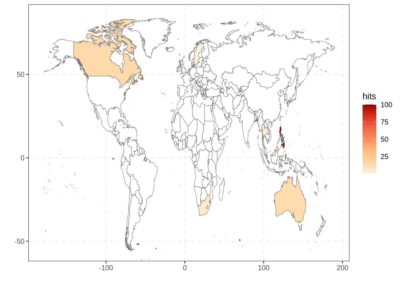
Mapping the interest of “storm surge” and “data science” in the world
In addition to analyze the trend over time with gtrendsR, we can also visualize the interest depending on the countries.
We see from this map that the number of Google searches for this term is quite low for many countries in comparison with other terms (white color means not enough search comparing to the total number of search). In general the interest is higher in countries that are more likely to be impacted by marine storms or hurricanes. The Republic of Philippines seems the most interested country in storm surge.
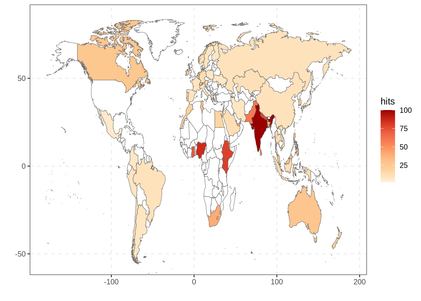
We can then continue with the term “data science”:
Much more countries are interested by this topic with India being the country with the highest number of Google searchs about data science.
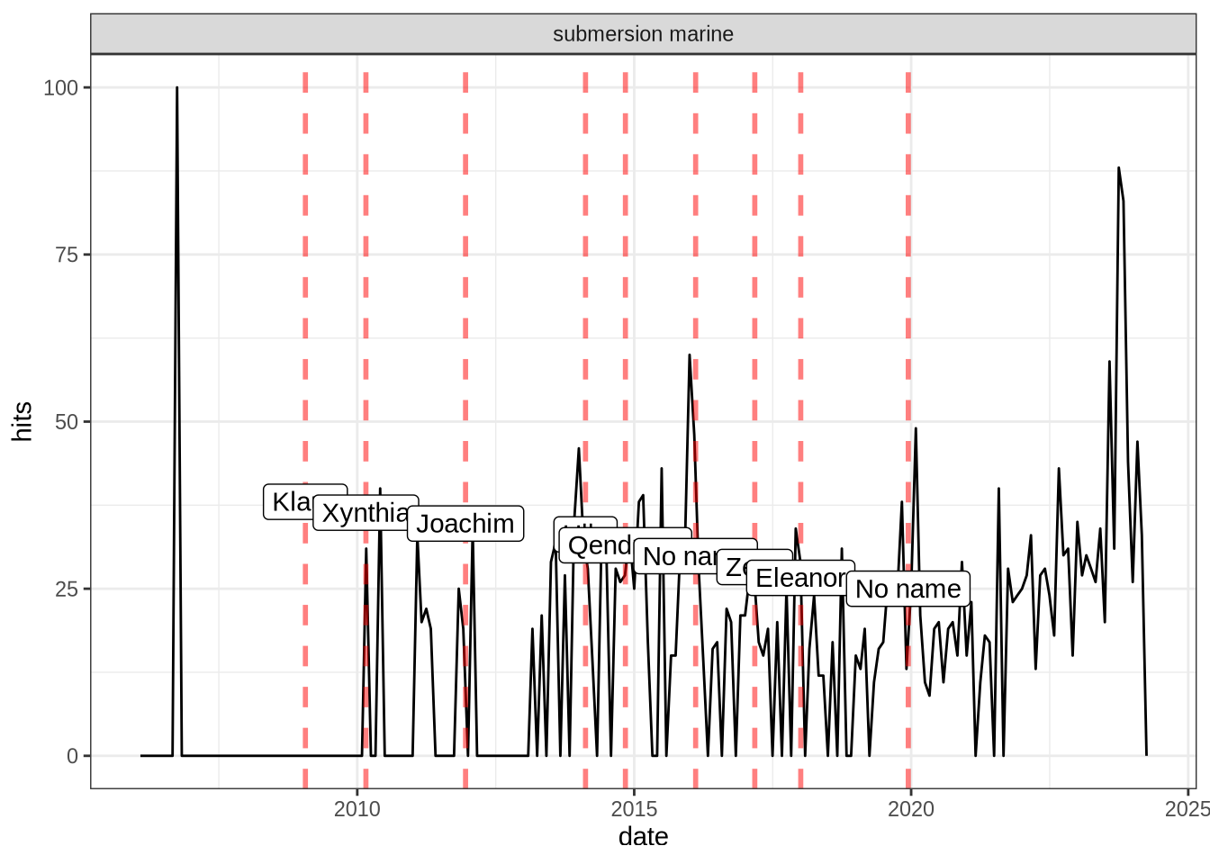
Focusing on the trend of “storm surge” in France
Earlier in this post, I made the hypothesis that the number of Google search for terms like “storm surge” was related to the recent occurrence of a storm event. Let’s investigate this hypothesis for the term “Submersion marine” (marine submersion/ flood in English) in France.
First, we extract the number of hits on this term for France by indicating geo = "FR" in the gtrends function. Then we create a data frame where we gather some severe storms that impacted France (Website listing the severe storms in France). Finally, we join all the information on the same graph (red dashed lines represent storm events):
From this figure, we can see that after a storm event there is often a surge in interest in the term “marine submersion” in France. This confirms my hypothesis !
Conclusion
This analysis was really interesting for me as it confirmed what I knew with numbers and graphs. Without a doubt, this analysis will be a great asset for my introduction, especially in the part where I will discuss about the growing interest in data science. I hope this post gave you the envy to reproduce this analysis for the terms of your choice !
---title: "Coastal risks and statistical learning: Analyzing Google trends with gtrendsR package"author: "Aurélien Callens"date: "2021-03-03"date-modified: "2024-02-06"format: html: code-fold: true code-tools: true code-summary: "Show the code"execute: freeze: true eval: truecategories: - R - EDA---```{r setup, include=FALSE}knitr::opts_chunk$set(warning = FALSE, message = FALSE, eval=TRUE)```I am currently in the third year of my PhD and it is time for me to synthesize all the work I have done by writing my thesis. One important step is the introduction which presents the general context and the contributions of my thesis in the research world. For my introduction, I decided to include the Google trend analysis of specific terms related to my PhD subject. For information, the aim of my PhD is to demonstrate the potential contributions of statistical learning methods in the study of coastal risks.In this post, we are going to use the R package `gtrendsR` to analyze the trends of specific words related to statistical learning such as "machine learning" or "data science" and also related to coastal risks: "coastal flood", "storm surge". ## Analysis of specific terms for the whole world In this first section, we are going to analyze the interest over time for several terms in the whole world. The `gtrends` function extracts the "hits" variable for a given term. This variable is a normalized measure of the interest made by Google Trends. The number of search is normalized by geography and time range, then the resulting numbers are scaled on a range of 0 to 100 based on a topic’s proportion to all searches on all topics. All the details are given in the support of Google Trends (<a href="https://support.google.com/trends/answer/4365533?hl=en" target="_blank">here</a>). We can look at the interest over time for "data science", "deep learning" and "machine learning":```{r}library(tidyverse)library(gtrendsR)words_stats <-c("machine learning","deep learning","data science")res_stats <-lapply(words_stats, function(x){gtrends(x,geo ="",time ="all")})interest_stats <-do.call("rbind", lapply(res_stats, function(x){x$interest_over_time}))interest_stats %>%mutate(hits =as.numeric(ifelse(hits =="<1", 0, hits))) %>%ggplot(aes(x = date, y = hits)) +geom_line() +facet_grid(~ keyword) +theme_bw()```From this figure, we see the increasing interest for these terms over the last decade. We can do the same for terms related to coastal risks : ```{r}words_coastal <-c("coastal risk","coastal flood","storm surge")res_coast <-lapply(words_coastal, function(x){gtrends(x,geo ="",time ="all")})interest_coast <-do.call("rbind", lapply(res_coast, function(x){x$interest_over_time}))interest_coast %>%mutate(hits =as.numeric(ifelse(hits =="<1", 0, hits))) %>%ggplot(aes(x = date, y = hits)) +geom_line() +facet_grid(~ keyword) +theme_bw()```Contrary to the interest for the statistical terms, the interest in terms related to coastal risk is more punctual. One of my hypothesis is that the interest in these topic increases after a large storm event has occurred in the world. We will investigate on this hypothesis at the end of the post. ## Mapping the interest of "storm surge" and "data science" in the worldIn addition to analyze the trend over time with `gtrendsR`, we can also visualize the interest depending on the countries. Let's start with "storm surge": ```{r}res_world <-gtrends("Storm surge",geo ="",time ="all")Int_country <-as_tibble(res_world$interest_by_country)Int_country <- Int_country %>% dplyr::rename(region = location)WolrdMap = ggplot2::map_data(map ="world")Int_Merged <- Int_country %>% dplyr::full_join(x = ., y = WolrdMap , by ="region") %>%mutate(hits =as.numeric(hits))Int_Merged %>%ggplot(aes(x = long, y = lat)) +geom_polygon(aes(group = group, fill = hits), colour ="grey40",size =0.2) +scale_fill_gradientn(colors = RColorBrewer::brewer.pal(7, "OrRd"),na.value ="white") +coord_cartesian(ylim =c(-55, 85)) +theme(legend.position="bottom") +theme_bw() +labs(x ="", y ="") +theme(panel.grid.major =element_line(size =0.5, linetype =2),panel.grid.minor =element_blank()) +labs(x ="", y ="")```We see from this map that the number of Google searches for this term is quite low for many countries in comparison with other terms (white color means not enough search comparing to the total number of search). In general the interest is higher in countries that are more likely to be impacted by marine storms or hurricanes. The Republic of Philippines seems the most interested country in storm surge. We can then continue with the term "data science": ```{r}res_world <-gtrends("Data Science",geo ="",time ="all")Int_country <-as_tibble(res_world$interest_by_country)Int_country <- Int_country %>% dplyr::rename(region = location)WolrdMap = ggplot2::map_data(map ="world")Int_Merged <- Int_country %>% dplyr::full_join(x = ., y = WolrdMap , by ="region") %>%mutate(hits =as.numeric(hits))Int_Merged %>%ggplot(aes(x = long, y = lat)) +geom_polygon(aes(group = group, fill = hits), colour ="grey40",size =0.2) +scale_fill_gradientn(colors = RColorBrewer::brewer.pal(7, "OrRd"),na.value ="white") +coord_cartesian(ylim =c(-55, 85)) +theme(legend.position="bottom") +theme_bw() +labs(x ="", y ="") +theme(panel.grid.major =element_line(size =0.5, linetype =2),panel.grid.minor =element_blank()) +labs(x ="", y ="")```Much more countries are interested by this topic with India being the country with the highest number of Google searchs about data science. ## Focusing on the trend of "storm surge" in France Earlier in this post, I made the hypothesis that the number of Google search for terms like "storm surge" was related to the recent occurrence of a storm event. Let's investigate this hypothesis for the term "Submersion marine" (marine submersion/ flood in English) in France.First, we extract the number of hits on this term for France by indicating `geo = "FR"` in the `gtrends` function. Then we create a data frame where we gather some severe storms that impacted France (<a href="http://tempetes.meteo.fr/" target="_blank">Website listing the severe storms in France</a>). Finally, we join all the information on the same graph (red dashed lines represent storm events):```{r}res_fr <-gtrends("submersion marine",geo ="FR",time ="all")df_storm <-as.data.frame(matrix(c("2009-01-24 GMT", "Klaus","2010-02-27 GMT", "Xynthia","2011-12-16 GMT", "Joachim","2014-02-14 GMT", "Ulla","2014-11-04 GMT", "Qendresa","2016-02-10 GMT", "No name","2017-03-06 GMT", "Zeus","2018-01-03 GMT", "Eleanor","2019-12-13 GMT", "No name" ), ncol =2, byrow = T), stringsAsFactors = F)names(df_storm) <-c("date", "Name of storm")df_storm$date <-as.POSIXct(df_storm$date, tz ="GMT")res_fr$interest_over_time %>%mutate(hits =as.numeric(ifelse(hits =="<1", 0, hits))) %>%filter(date >as.POSIXct("2006-01-24 GMT", tz ="GMT")) %>%ggplot(aes(x = date, y = hits)) +geom_line() +geom_vline(xintercept = df_storm$date, col ="red", lty =2, alpha =0.5, lwd =1) +geom_label(aes(x=date, y =seq(38, 25, length.out=nrow(df_storm)), label =`Name of storm`), data = df_storm) +#geom_vline(xintercept = as.POSIXct("2011-07-11 GMT", tz = "GMT"), col = "blue", lty = 2, alpha = 0.5) + facet_grid(~ keyword) +theme_bw()```From this figure, we can see that after a storm event there is often a surge in interest in the term "marine submersion" in France. This confirms my hypothesis ! ## Conclusion This analysis was really interesting for me as it confirmed what I knew with numbers and graphs. Without a doubt, this analysis will be a great asset for my introduction, especially in the part where I will discuss about the growing interest in data science. I hope this post gave you the envy to reproduce this analysis for the terms of your choice !